What Printing In Color Says About Your Company
| Jun 18, 2013Everyone knows that printing in black and white saves you big bucks. However, not printing in color could be hurting your company’s income. Design Follow recently published an article featuring infographics explaining why printing in color is so important to businesses and why it should not be eliminated when trying to cut cost. According to their research, businesses that print in color produce documents of a higher quality and in return, the business is viewed as more successful. Printing is also more likely to attract new customers and clients as well as help both existing and potential ones remember content.
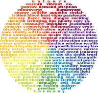
Since printing in color does cost more, it is important to know the effect the colors you are using will have on the viewers of the material. Individual colors can have different psychological effects on consumers. Check out what each color says about your brand and use these colors to help improve the power of your colored marketing materials:
- Blue - Honest and conservative. Use this color when you want your audience to trust you. Also use a shade of blue when you want to show that you are being traditional or exercising caution.
- Red- Passion and urgency. Using red indicates that you are trying to talk about something time sensitive or something opinionated.
- Orange- Risky and affordable. These two words may sound contradicting, but think about where we see this color. Stores tend to use orange clearance tags. Clearance means reduced price and affordability. We also see this color in construction zones and detours, it grabs attention and signals risk or something out of the ordinary that could cause potential risk.
- Yellow- Playful. This is the color used most often in display windows. It indicates fun and makes those who view it feel lighthearted.
- Pink- Caring. Want to show your audience that your efforts are in their best interest or show your sensitivity to an issue? Using pink will help you establish your company as one with a lot of compassion.
- Green- Eco-friendly. Everyone has heard the phrase Go-Green. It is because of this phrase that green is forever associated in people’s minds as the environmental color.
- Purple- High quality and expensive- If you want to emphasize quality and make people feel that a higher price is valid for a service or item, use the color purple.
- Silver- Elegant, luxurious, and refined. Using this color indicates high class and sophistication.
 |
|---|
| Image found at: www.mmprint.com |
After you decide which colors are cohesive with your message, next is to decide how many colors to use. Marketing documents typically are created with either two or four colors. Just because six colors could potential relay the message you are hoping for, it doesn’t mean you need to use all six of them. Instead, pick either two or four with strongest message or the ones that look best together.
Another tip would be to include black along with your colors. Black indicates high quality, excellence, and sophistication. It also will lessen the amount of color ink being used and therefore will reduce your costs. If you are printing a large quantity of colored materials, consider checking out the prices at your local professional printing company. It might be cheaper to outsource larger projects than printing them in-house.
Comment below and let us know which colors do you think best describe your brand? Have you seen a greater response to printed materials versus black and white?
About the authors: Andrew Yeung is president of CompAndSave, a leading online provider of premium printer ink cartridges, including remanufactured and compatible printer ink cartridges. With deals every month and a 1-year guarantee of quality, CompandSave provides an easy way for people and businesses to purchase printer ink and accessories.
Learn about CompandSave’s deals and news from the world of printing by following us on Facebook, Twitter, LinkedIn !