Changing Your Font Can Save You Money On Ink
| Apr 13, 2013 |
|---|
| Image Found At: www.moneysmartfamily.com |
Does your printer go through ink rapidly? Before taking it out on the machine or the ink cartridges, ask yourself what fonts you are using.
We all like to get a little crazy with our font choices every now and again, but doing so can actually cause ink cartridges to run dry faster. Printer.com perfomed a test where they printed documents with a varity of popular fonts to see which font choice used the least amount of ink. The winner was Century Gothic. They estimated the average at-home printer printing around 25 pages a week in Century Gothic font would use $20 less ink a year. If you’re a business using one printer and printing around 250 pages a week the savings could equal up to $80 a year. If your business uses multiple printers you could expect to save hundreds.
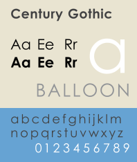 |
|---|
| Example of Century Gothic Font |
If you company doesn’t already have a standard font and you like Century Gothic this would be a great way to cut cost! But what if Century Gothic isn’t a font you are fond of? Or, what about if you already have a font that is associated with your brand? Don’t worry! You can still save money with this discovery:
- Print all draft documents using the font Century Gothic. Chances are that if you are printing documents to be sent out on behalf of your business, that you will print a draft copy. Often, multiple drafts have to be printed. By printing the drafts in Century Gothic you are reducing the amount of ink used with the more expensive font.
- Use Century Gothic for all interoffice communications. When printing out emails, memos, office newsletters, poster or office signage using this font will save you money. These are documents that only yourself and your employees will be seeing. It won’t hurt your brand identity to stray from your typical font for these documents. Another tip would be to stop printing memos and email them instead.
- Use Century Gothic for larger fonts. It might not be your cup of tea to use Century Gothic for body text but using it for large headlines or title pages would be a small way to save. The larger the font the more ink so switching only your larger fonts to Century Gothic would be a good place to start.
When trying to preserve ink, small changes go a long way. Trying to limit the amount of pages printed can help, but printing is inevitable so it is important to look at what you’re printing. Another suggestion would be font size. Even changing your font from 12 pt to 10 pt is a step in the right direction.
Do you have any tips on preserving ink? What do you do in your office to save ink? What do you think of Century Gothic font? Tell us in the comments!
About the authors: Andrew Yeung is president of CompAndSave, a leading online provider of premium printer ink cartridges, including remanufactured and compatible printer ink cartridges. With deals every month and a 1-year guarantee of quality, CompandSave provides an easy way for people and businesses to purchase printer ink and accessories.
Learn about CompandSave’s deals and news from the world of printing by following us on Facebook, Twitter, LinkedIn!